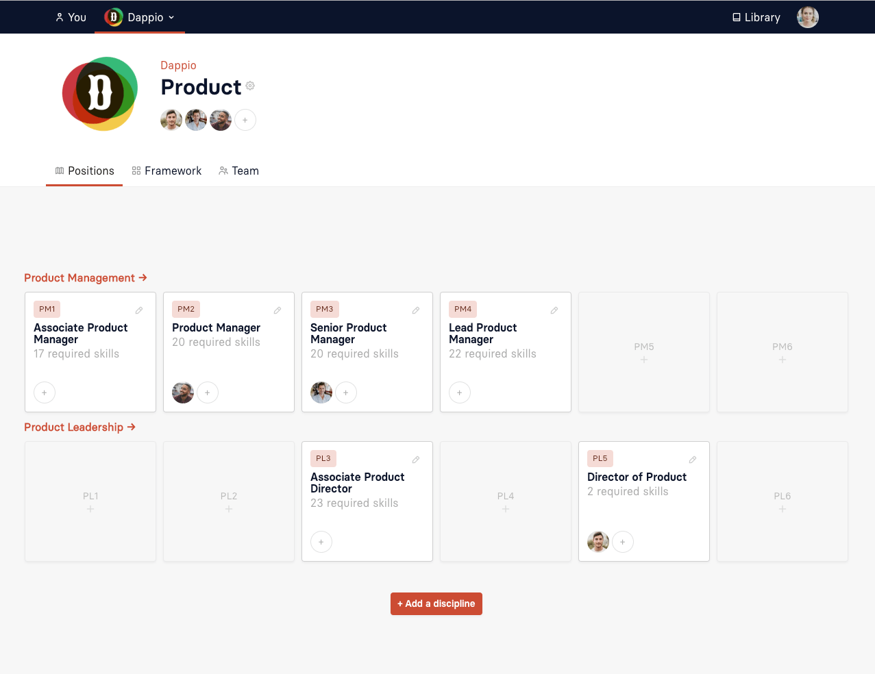
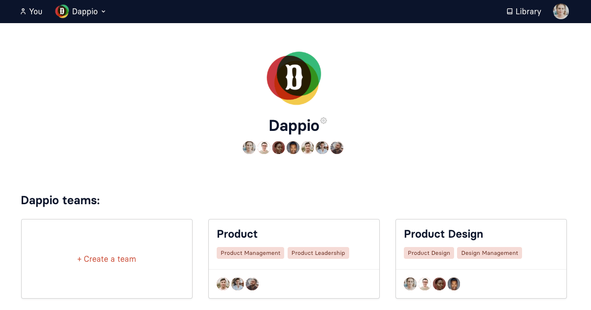
Using products like Twitter and Trello every day, I've long appreciated the importance of making my regular online tools feel like home with my own colour scheme.
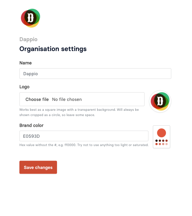
Luckily since Progression's inception we've allowed teams to enter a hex value (e.g. #ff0000 - red) as their brand colour. We just never really used them — which thinking about it must have been pretty underwhelming.
Well this week I did one of my classic 'not on the roadmap' evening hacks, and decided to spend an hour or two seeing how hard it would be to add theming into our app.
It would turn out to be an interesting journey of discovery with a lot of 'today I learned' moments.
Not all colour spaces are created equal.
Many reasonably technical folks understand and maybe even know their company colour in HEX. In fact some may understand RGB too – three numbers from 0-255 corresponding to Red Green and Blue.
It's unlikely that they know HSL, the lesser known cousin. It happens to be by far the most powerful of the colour spaces.
HSL stands for Hue, Saturation and Lightness. Hue is measured as a 360° colour wheel and saturation and lightness are 0-100%. You end up with a list of one angle° and two % numbers separated by commas.
What's great though is that having lightness and saturation allow you to manipulate a colour programatically in a really easy way without affecting the important one for most, the hue. And Hue being seperate means you can programattically find complimentary colours by just subtracting an 'angle' from your hue value.
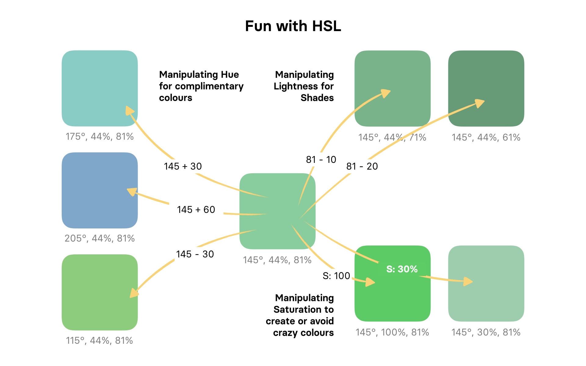
So if I have an HSL colour of 145°,44%,81% I can decide to spit out complimentary colours by changing the Hue, shades of the same colour using the lightness and I can also avoid some of the crazy combinations that make UI unusable by controlling saturation. All just with maths. 🤯
Why do the conversion at all though? Hex works in css just fine...
The problem was, allowing people to put in any colour meant people would put in colours that just didn't work in our UI. We needed to be able to manipulate them, create lighter and darker versions for button hover states and background colours on things, and generally control for poor accessibility.
Luckily for me, who had asked our customers for Hex values, you can convert Hex to HSL and back fairly easily.
Sass renders before grabbing css variables
I had initially hoped to keep my lighten() darken() and color-scale() sass manipulators with my new colours.
However, it turned out that when sass precompiles your css it doesn't know anything about those variable syet. It's just moving the string around, not looking into it. So trying to darken a string is obviously not going to work.
I was going to have to create all my variables as css variables for my theme colours and just reference them in sass.
Getting variables from our database and turning them into arrays of css variables.
Usually you would create css variables with a style tag. However it quickly became apparent that as I was using js to manipulate the styles anyway, having a script tag (to manipulate) inside a style tag (to set variables) felt.. icky.
But hooray, you can set css variables with javascript. This became my friend. I ended up creating a json route in the app that was hit on page load, pulling in the hex (or a fallback) which I would then pass through my js to create my HSL values. Then it was just a case of running all variants through this command to create my variables.
(Later on we changed this method, but it worked fine!)
getComputedStyle(document.documentElement)
    .getPropertyValue('--my-variable-name');
People have some weird brand colours

OK so all well and good, I spat out the brand colour and then created an array of different lightnesses. Then in my variables.scss I created variables from my variables.
Working through my templates, it was easy to grep $brand-color and swap out with $theme-color (or $theme-color-10, 20, 30 etc. as I went along. What I didn't anticipate was how weird some teams' brand colours would be.
Very quickly on rolling out the theming we found some examples of borderline unusable UIs because some colours which look normal are actually pretty weirdly constructed (for example if saturation is really high and lightness is low, the colour looks muted. As soon as you drop that lightness, shit gets crazy).
So the final step was to block super high saturation. I chose to limit saturation to 60 with a (s>60?60:s) on incoming saturation value. That's good enough for now.
Future improvements
- We're thinking of adding a package like color so we can detect luminosity. Only then will we be able to avoid accessibility issues and strange UI's.
- Frankly, the number of elements we've applied this to may be overkill. If it feels too much we may pull it back a bit, but for now it feels cool to have your Progression UI look like yours.
Enjoying these posts? Got any feedback? Feel free to email us at team@progressionapp.com.

